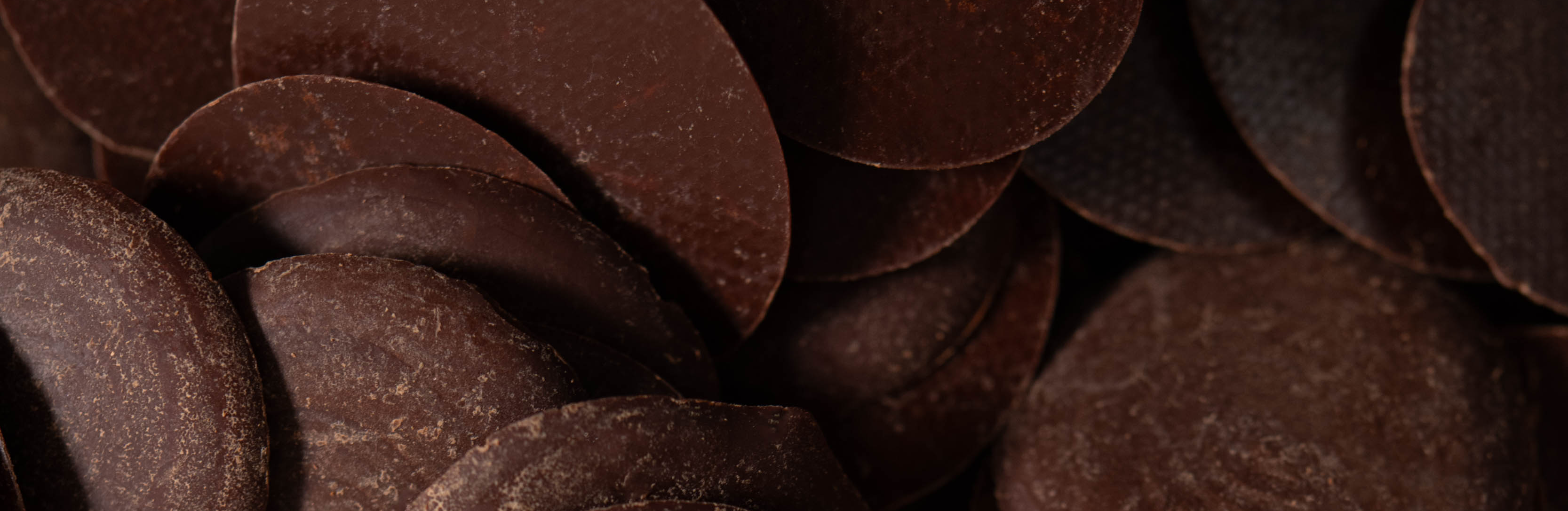
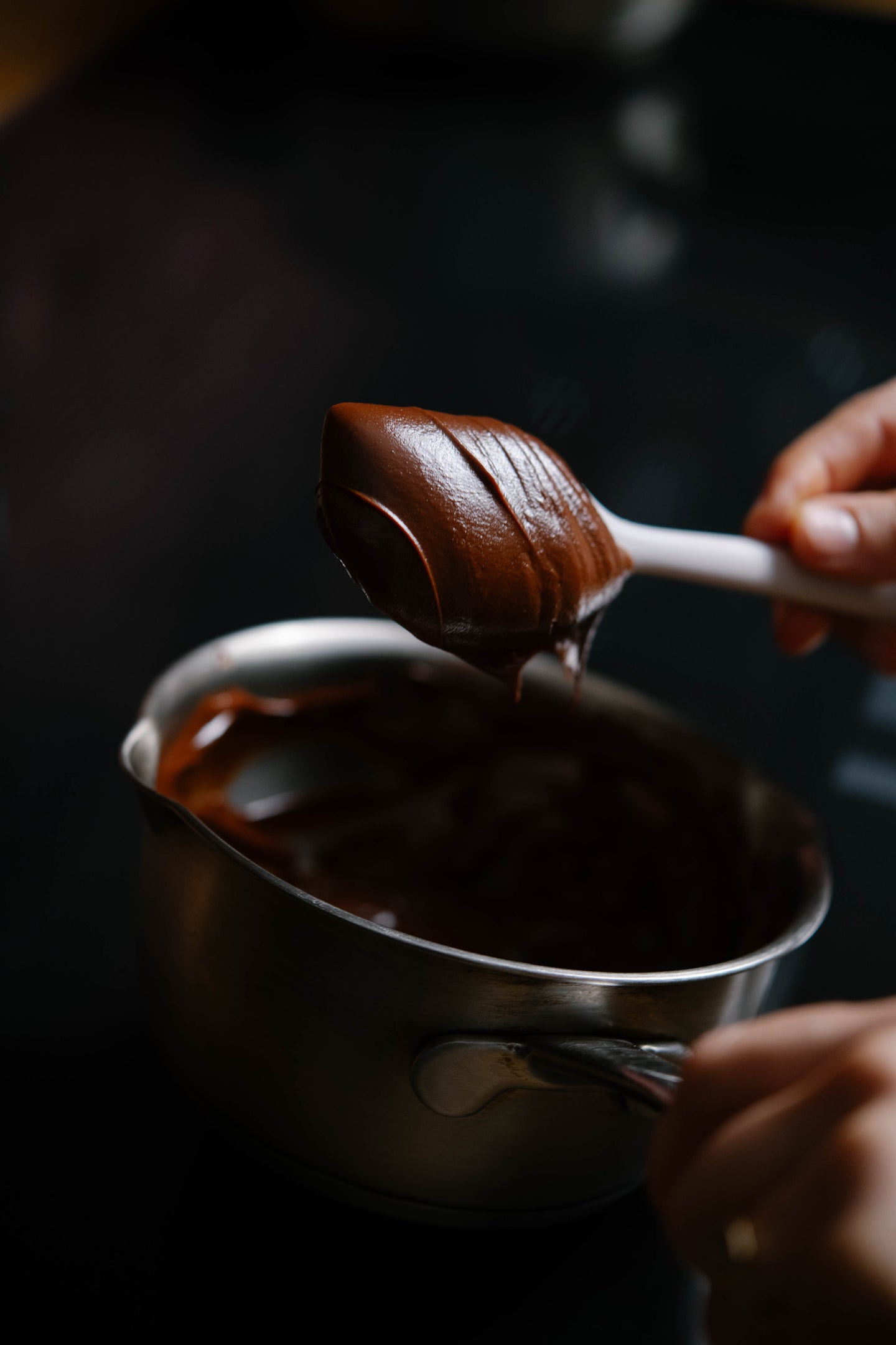
In the most creative kitchens, our products inspire preparations that showcase the sensorial richness of Colombian specialty cocoa.
The selection process allows each chef to create a cocoa blend that meets their sensory needs and culinary needs.
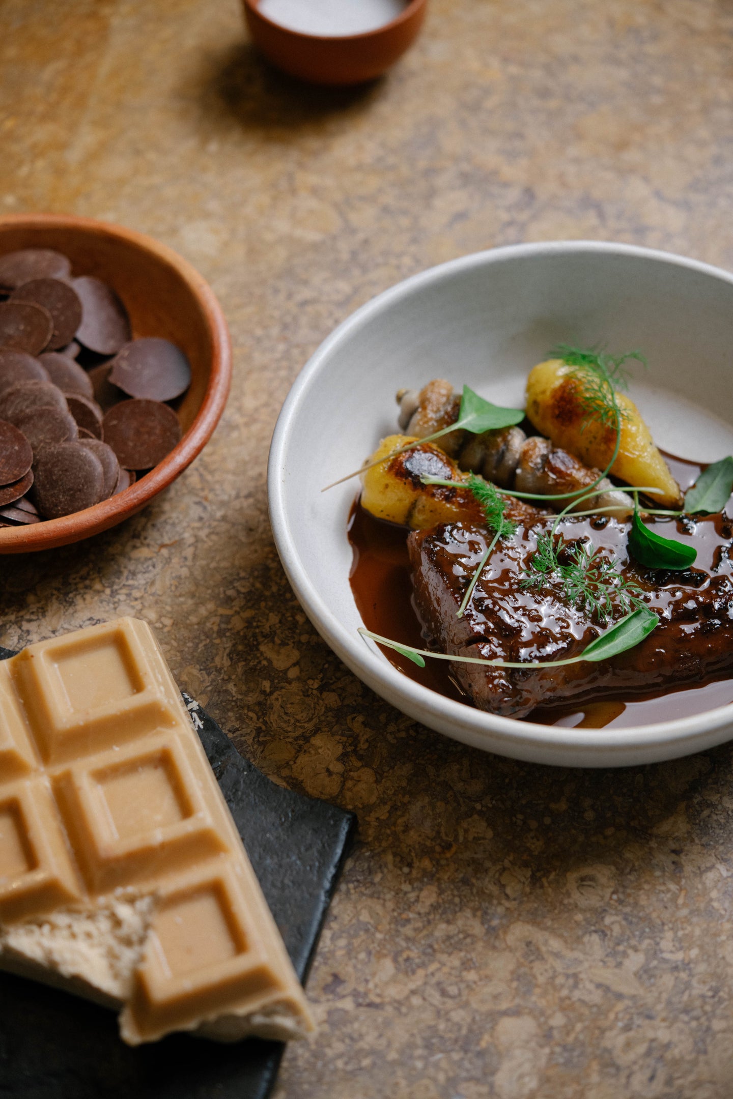
In the most creative kitchens, our products inspire preparations that showcase the sensorial richness of Colombian specialty cocoa.
The selection process allows each chef to create a cocoa blend that meets their sensory needs and culinary needs.
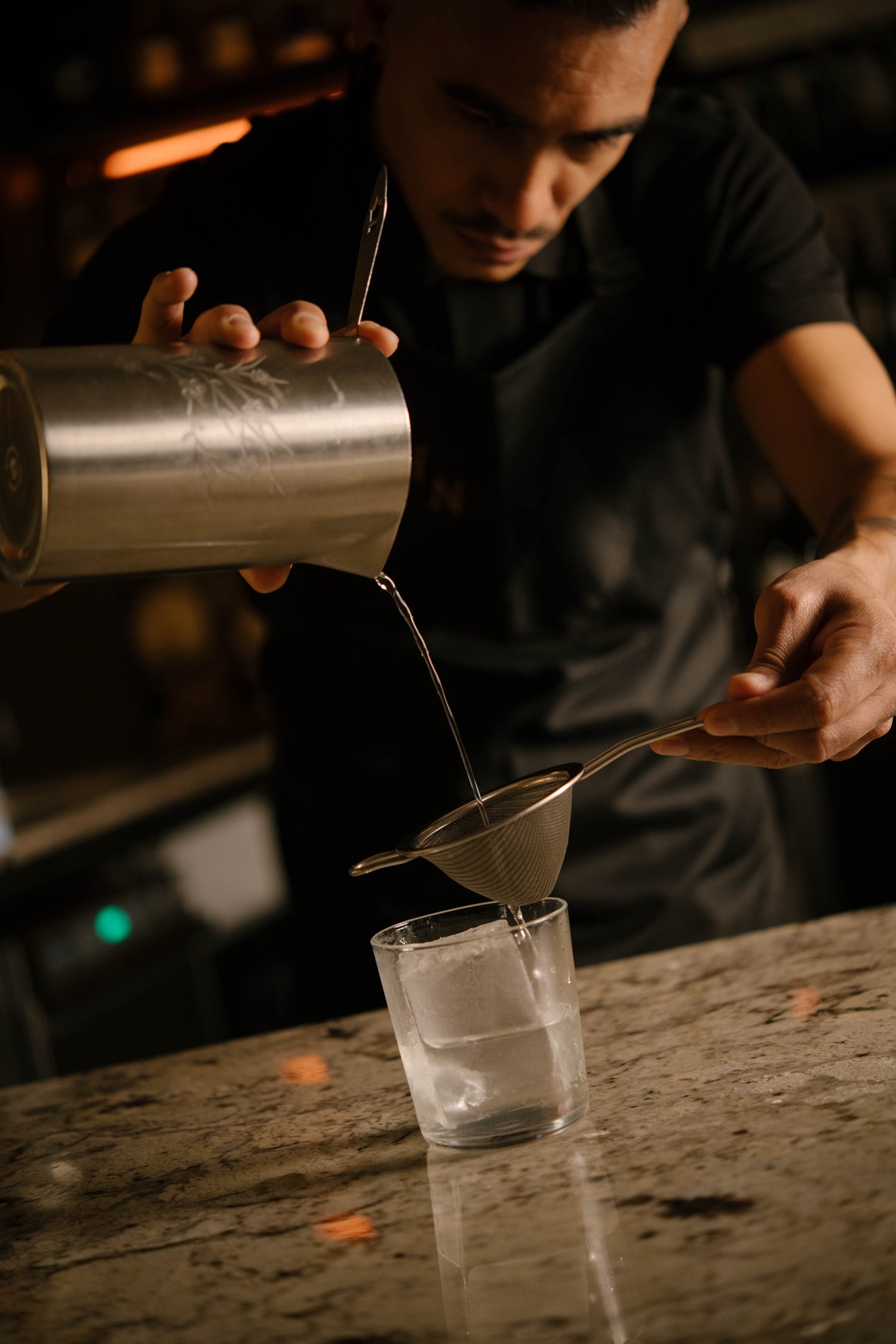
Behind the bar, our products pave creative paths for cacao in the world of mixology.
Our wide range of cocoa butter and husk by origin, as well as the variety of roasts we use, allows us to think beyond traditional dark cacao cocktails.
Schedule a guided tasting of our portfolio.
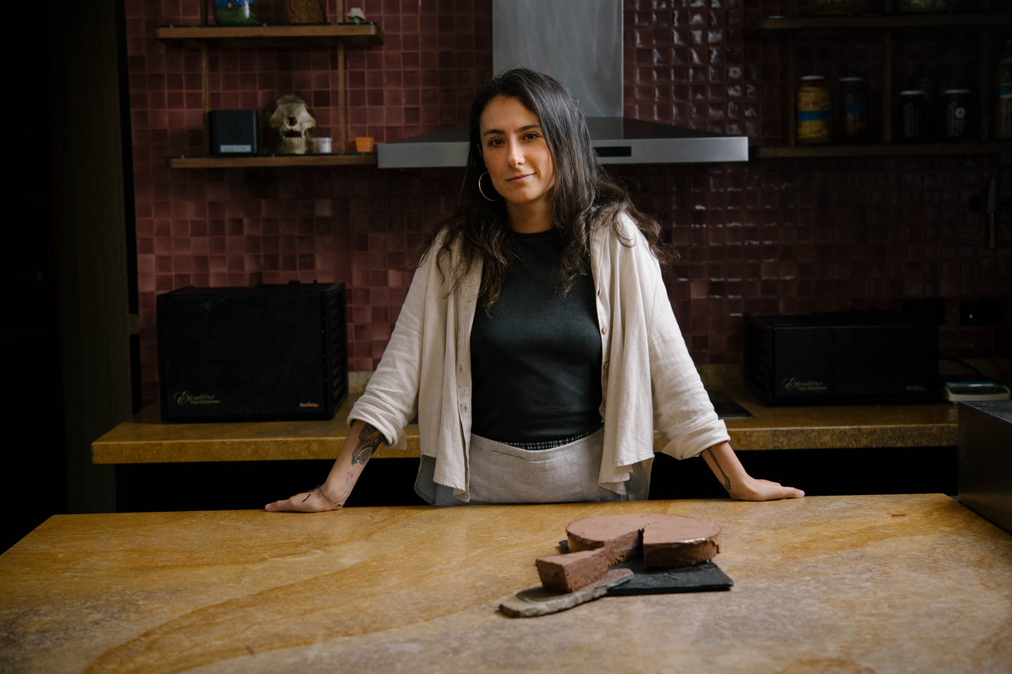
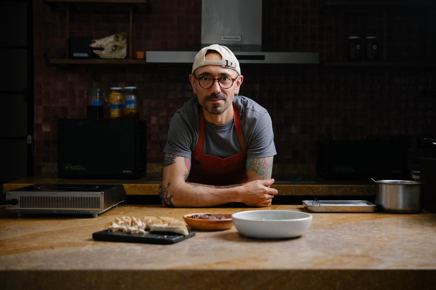
We are in the best kitchens
Afluente. El Chato. LEO. Mesa Franca. NIA Bakery. Oriente. Prudencia. Salvo Patria.We are in the best kitchens
Afluente. El Chato. LEO. Mesa Franca. NIA Bakery. Oriente. Prudencia. Salvo Patria.